This design solution was created as a student project. The goal was to select a real world brand, evaluate potential weakness of their current mark and then create an alternative.


The Assignment:
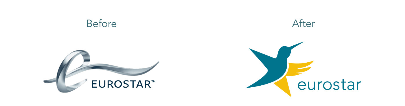
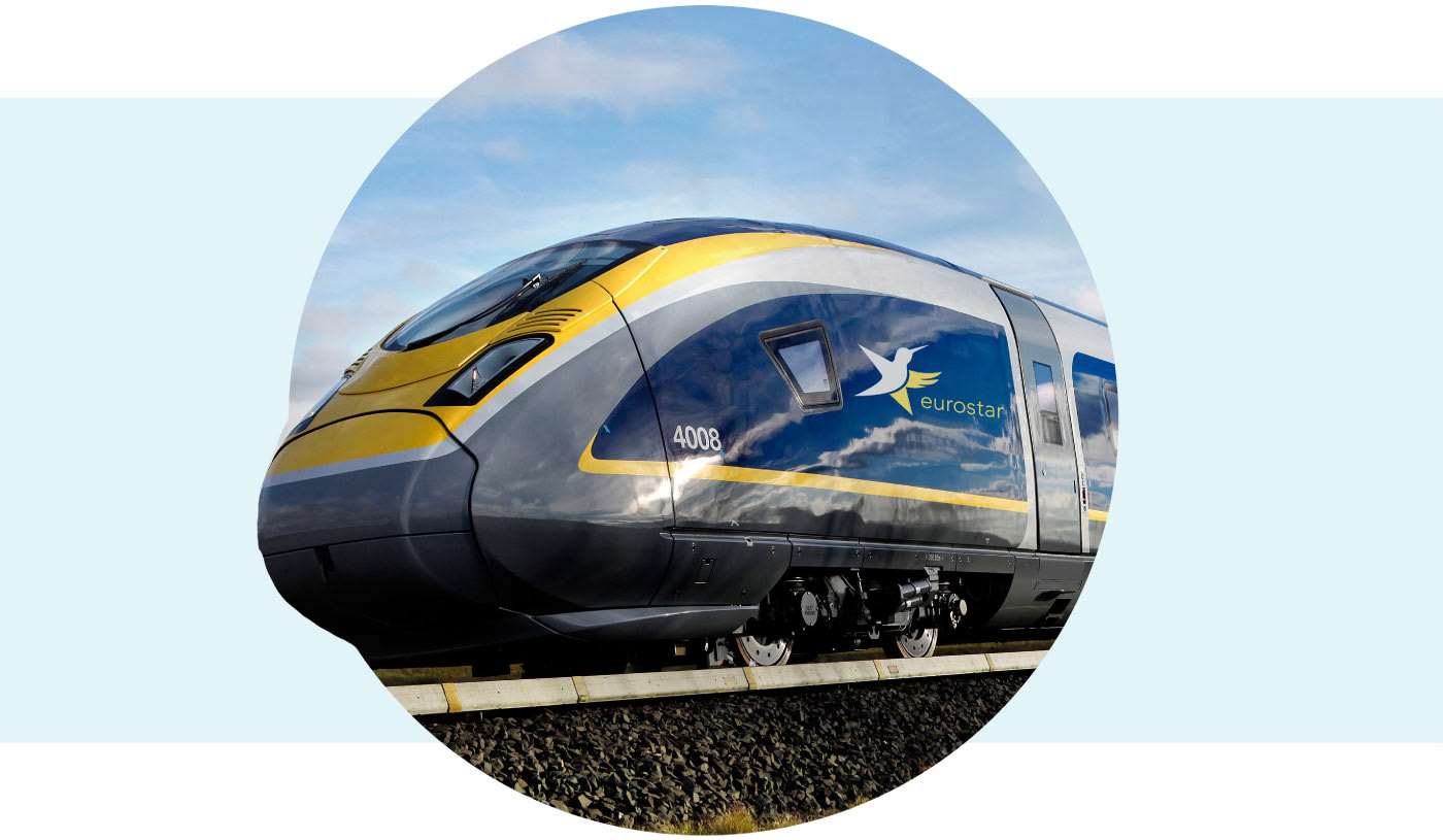
I selected the Eurostar logo to redesign because their current logo incorporates 3D effects that can be quite difficult to use across various applications and invokes a dated design aesthetic. My goal was to create a solution that felt modern, clean, friendly and was easier to apply across print, web, and real life application.
Design Rationale:
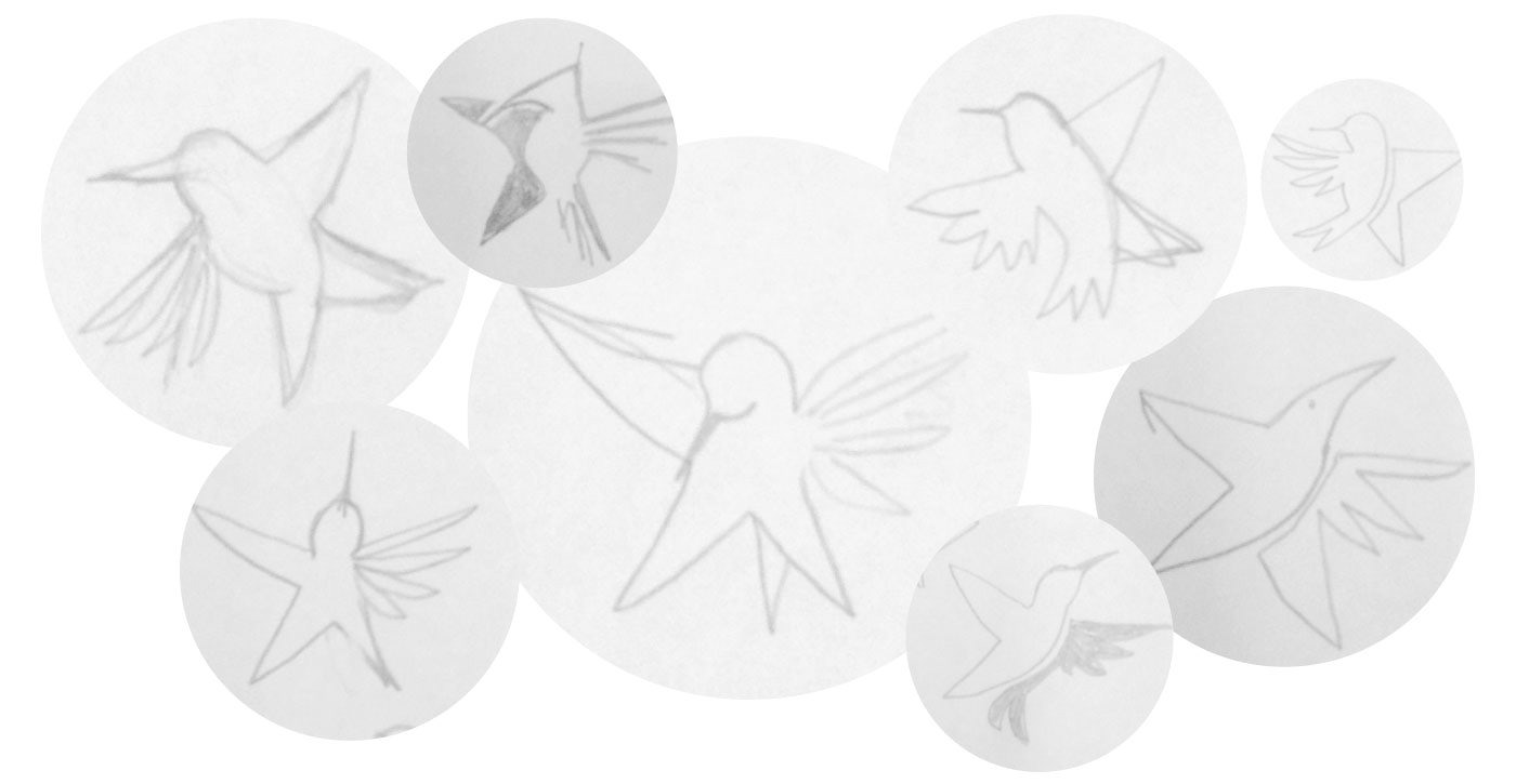
Riding the Eurostar is very unique. You are traveling at great speeds, but your experience of such speed is smooth, effortless and relaxing. I felt that a great visual metaphor for this experience of speed and luxury was the image of a hummingbird. Hummingbirds are flapping their wings at about 80 beats per second, yet they are graceful, beautiful and float with confidence. Combining this idea with a star, imagery from the brandname, resulted in my final solution.